
The app worked. But only on phone.
Every Flutter project I started ended up the same way.
I’d build something, it’d look great on my phone, and then I’d open it on a tablet or resize the window on desktop — and it’d just be this sad, stretched list taking up the entire screen. One column. No sidebar. No detail panel. Just vibes.
So I’d go fix it. And that’s where the real pain started.
The if-else spiral
You’ve seen this code. You’ve probably written it too.
if (MediaQuery.of(context).size.width > 1024) {
  // desktop layout
} else if (MediaQuery.of(context).size.width > 600) {
  // tablet layout
} else {
  // phone layout
}
Fine for one widget. But then you need it in the AppBar. And the navigation logic. And the detail panel. And the sidebar. And the FAB visibility. And before you know it, every file in your project has this same conditional sitting inside build(), each with slightly different magic numbers.
600. 720. 1024. 800. Scattered everywhere. Not one source of truth.
And when the designer says “actually let’s change the tablet breakpoint to 680” — you grep through 15 files and pray you got them all.
Then I tried existing packages
There are some good ones out there. But most of them came with opinions I didn’t ask for.
They’d give me a NavigationRail I didn’t want. Or a Drawer that looked nothing like my app. Or a pre-built scaffold that handled layout but had no answer for navigation — so I still had to wire up the push/pop myself and figure out when to show a detail panel vs when to push a new route.
The packages that handled layout didn’t handle navigation.
The ones that handled navigation didn’t handle layout.
None of them cared about my router.
I was using GoRouter. The package assumed Navigator.push. I’d end up writing adapter code just to make the two talk to each other, which kind of defeats the point.
The navigation thing was the worst part
Here’s the scenario I kept running into:
User taps an item in a list.
- On phone: push a new route, full screen.
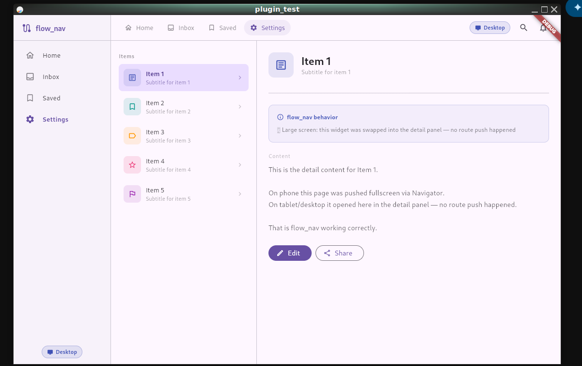
- On tablet/desktop: swap the detail panel on the right. Don’t push anything.
Simple concept. But the code to handle this correctly — accounting for screen size, calling the right navigation method, keeping the detail panel state in sync — ended up being this tangled mess that lived in every single screen that had a list.
Every. Single. One.
I’d copy-paste it, tweak it slightly, forget to update one of the copies, and end up with bugs that only appeared on tablet. The kind that slip past testing because you test on your phone.
So I pulled it all out
I started extracting this logic into a shared utility. Then the utility grew. Then I realized it was basically a mini framework for adaptive Flutter apps — and other people probably needed it too.
That became flow_nav.
The idea is simple: you describe your layout once, and the package figures out what to do based on screen size. You don’t write breakpoint checks. You don’t wire up navigation conditionals. You just tell it what your body is, what your detail panel is, what your sidebar is — and it handles the rest.
FlowScaffold(
  appBar: FlowAppBar(
    title: Text('My App'),
    toolbarWidget: MyDesktopToolbar(),
  ),
  body: MyListView(
    onItemTap: (item) {
      FlowNavController.open(
        context: context,
        builder: (_) => DetailPage(item: item),
        onDetailOpen: (w) => setState(() => _detail = w),
      );
    },
  ),
  detailPanel: _detail,
  sidebar: MySidebar(),
)
On phone, sidebar is ignored, detailPanel is ignored, tapping an item pushes a new route.
On tablet, you get a split view — list on the left, detail on the right.
On desktop, you get three columns — sidebar, list, detail.
One widget. All three layouts.
It doesn’t touch your UI
This was the thing I was most careful about.
flow_nav has no default styles, no pre-built components, no color scheme, no navigation rail, no drawer chrome. It provides zero UI opinions. Your AppBar looks like your AppBar. Your sidebar looks like whatever you pass in. Your detail panel is just a widget.
The package handles when and where things appear. You handle what they look like.
That also means it doesn’t care about your router. You can plug in GoRouter, GetX, AutoRoute, or just the plain Navigator:
// GoRouter
FlowNavConfig.init(
  onPush: ({required context, required builder, fullscreenDialog = false}) {
    context.push('/detail');
    return Future.value(null);
  },
  onPop: (context) => context.pop(),
);
Set it once in main.dart and forget it. FlowNavController.open() will use your router on phone and skip it entirely on larger screens.
What it looks like across screen sizes
| Phone | Tablet | Desktop | |
|---|---|---|---|
| AppBar | Standard | Toolbar in split view | Toolbar above content |
| Layout | Single column | List + Detail | Sidebar + List + Detail |
| Navigation | Full-screen push | Detail panel swap | Detail panel swap |
| Bottom nav | ✅ | ❌ | ❌ |
Is it perfect?
No. It’s 1.0.0.
There are things I want to add — better animation when the detail panel swaps, a more flexible column sizing API, maybe some helpers for common empty states. If you use it and run into something rough, open an issue. I’ll actually look at it.
Where to get it
dependencies:
flow_nav: ^1.0.0- pub.dev: pub.dev/packages/flow_nav
- GitHub: github.com/cas8398/flow_nav
If it saves you from writing one more MediaQuery.of(context).size.width > 600 check, it did its job.
